Table of Contents
The 2.2 release of MantidPlot includes the “SpectrumView” data viewer, a viewer that quickly displays a large collection of spectra as an image. The viewer can be started from the right-click menu of a matrix workspace by selecting ‘’Show Spectrum Viewer’‘. Each row of the image represents one spectrum.
If the user points at a location on the image the data from that spectrum are displayed on a graph across the bottom of the image, and the data from the different spectra for that column are displayed on a graph at the left side of the image. Basic information about that point on the image is shown in the Image Info table. Similarly information about a position pointed at by the user in a graph is displayed in the table associated with that graph.
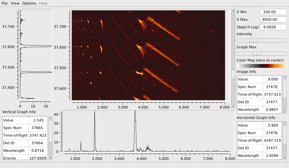
For example, the figure shows the spectra from slightly more than three LPSDs on the ARCS instrument at the SNS. The four horizontal dark lines across the image are due to there being no data from pixels at the ends of the LPSDs.The image quickly shows several interesting aspects of the data, includingpowder lines, single crystal peaks and a dead-time of the LPSDs for approximately 200 micro-seconds following particularly strong SCD peaks.
The spectra displayed are initially binned in 2000 uniform steps. They can be quickly rebinned for the viewer by specifying new values for X Min, X Max and a new Step size.
If the step size is positive, it specifies the size of the uniform bin width to use across the selected X range. If the step size is negative, its absolute value specifies the fractional increase for each bin boundary in a “log” scale. The effect of rebinning with a large number of small bins is most useful in combination with the horizontal scroll bar, described below.
If there are more spectra than can be displayed at one time, the image can be scrolled up and down using the vertical scroll bar at the right side of the image. In this way, all spectra from an instrument with hundreds of thousands of detector pixels can be examined quickly. The View menu includes a control to turn off the vertical scroll bar. If the vertical scroll bar is turned off, then the number of spectra displayed is limited to the number of rows in the displayed image. For example, if there are 500 rows in the image, but there are 5,000 spectra to display, then the image will be formed by using every 10th spectrum. While this can be useful in some cases, this subsampling of the available spectra can also miss important features and can suffer from various “aliasing” effects. For this reason the vertical scroll bar is turned on by default.
The view menu also has a control to turn on a horizontal scroll bar to scroll the image left and right. This will only be useful when the spectra are binned using more bins than the number of image columns. In this case, the horizontal scroll bar will allow scrolling the image and associated graph left and right to examine other portions of the spectra. If the horizontal scroll bar is turned off, and the binning controls specify more bins than can be displayed, the binning is adjusted to match the number of displayable columns before the image is created.
The user can use the left mouse button to point at features on the image or graphs. This will initiate a full size crosshair cursor for comparing features and will show information about the selected point in the table associated with the image or graph in use. The information is for the selected spectrum and X location. The “Value” shown is the value of the spectrum in the selected bin, using the current binning.
A pseudo-log intensity scale is used to help see lower intensity features in the same image as high intensity peaks. The relative intensity of low intensity features to high intensity features is controlled by the intensity slider.
When the slider is fully to the left, the mapping from data value to color index is linear. As the slider is moved to the right low intensity features are increasingly emphasized, relative to the maximum intensity in the displayed image.
The selected color scale is always fully used. If the image is scrolled to display a different portion of the image, the mapping is adjusted so that the largest positive value present in the image is mapped to the largest color index.
The color scale in use is displayed in a color bar on the right side of the viewer. This color scale is “two-sided” in that separate color scales are used for negative and for positive values in the data. In the example shown, values greater than or equal to zero are mapped to colors ranging from black to red, orange and then white. Negative values range from black through shades of gray. The pseudo-log intensity scaling is actually applied to the absolute value of the data intensity, before mapping to a color. This allows small negative as well as small positive values to be seen and distinguished in the presence of large peaks. This can be useful when dealing with data that was obtained by subtracting two workspaces, such as when background is subtracted, since due to errors in the data, this often introduces negative “intensities”.
The displayed graphs are just cuts through the displayed image. That is, the graph of a spectrum across the bottom of the window is obtained from the corresponding row of the image data. Consequently, the graph shows that spectrum as rebinned for the image display. Similarly, the graph at the left side of the window is obtained from the corresponding column of the image data, so it shows values from whatever spectra formed the image, at the selected bin.
The graphs are both “auto-scaling” and adapt to the range of values in the selected portion of the data. The Graph Max control allows the user to see lower level features in the data by reducing the portion of the range of values that are displayed. When the control is at the right limit, 100% of the total range is displayed. When the control is in the middle, only 50% of the total range is displayed. When the control is at the far left, only 1% of the total range is displayed.
Each of the graphs is in a separate pane that can be collapsed to zero size, if not needed. The “control” for this is a small graphical “handle” on a divider between the graph and image. The graph size can be altered by grabbing the handle with the left mouse button pressed. The size can be increased or decreased to a minimum size. If the handle is moved substantially below the minimum size, the graph will collapse to zero size.
Category: Interfaces